
A better filter makes the catalog feel smaller without making the business smaller.
Most ecommerce teams treat filters as interface furniture. They add price, size, color, and brand, then move on to campaigns, landing pages, and promotions.
That misses the point. Product filtering is a merchandising decision exposed through an interface. It tells shoppers what the business believes matters, what can be compared, and how quickly a broad catalog can become a useful shortlist.
When filters work, customers feel understood. When they fail, shoppers blame the catalog, the product range, or themselves. Most leave before they ever reach the product page.
The catalog is part of the pitch
A large assortment sounds like value until a shopper has to work through it. Twenty-seven versions of a product can signal choice, or it can signal that nobody has helped the customer decide what belongs together.
The filter panel is where the store makes that decision visible. A good filter system lets people express a real buying constraint, such as fit, compatibility, use case, capacity, or delivery timing. A weak one forces them to translate their intent into the store's internal taxonomy.
That translation is expensive. A customer thinks, “I need a compact carry-on for a three-day trip.” The store offers color, material, and a vague collection called “Travel.” The problem is not a missing button. It is a merchandising system that does not reflect the customer's job.

Customers arrive with a job to complete, not a taxonomy to study.
Start with buying decisions
The usual filter list comes from the product database. That is backwards. Start with the decisions customers make before they buy, then map those decisions to clean, consistent product attributes.
For a clothing store, “size” may be table stakes. The more useful filters might be occasion, cut, warmth, stretch, or care requirements. For a cannabis retailer, a customer may care about format, onset expectations, price range, and availability for pickup. Those terms need careful, compliant presentation, but ignoring them does not make the underlying demand disappear.
The right question is not “Which fields do we have?” It is “Which constraints help a customer reject the wrong options with confidence?”
That distinction keeps the experience useful. It also makes content and SEO more honest because category pages can be built around real shopping language instead of a pile of interchangeable keywords.
The same discipline applies to refreshing content before publishing more content, where the goal is better usefulness, not simply more URLs.
More filters can make less sense
A filter is valuable only when it changes the decision. A long list of near-duplicate attributes creates the appearance of control while increasing cognitive load.
Watch for filters that are technically accurate but practically weak. “Collection,” “style,” and “theme” may each describe the same grouping. “Premium,” “best,” and “featured” may be editorial labels masquerading as objective criteria. If a shopper cannot predict what will happen after selecting a filter, the control is not doing much work.
Use three tests:
- Can a customer understand the filter without internal product knowledge?
- Does each option describe a meaningful difference in the products shown?
- Does applying it leave a useful result set rather than a dead end?
The last test matters. Empty states are not just a technical problem. They reveal a mismatch between how products are tagged and how customers shop. A store that repeatedly returns zero results for ordinary combinations has a data-quality problem wearing a UX costume.
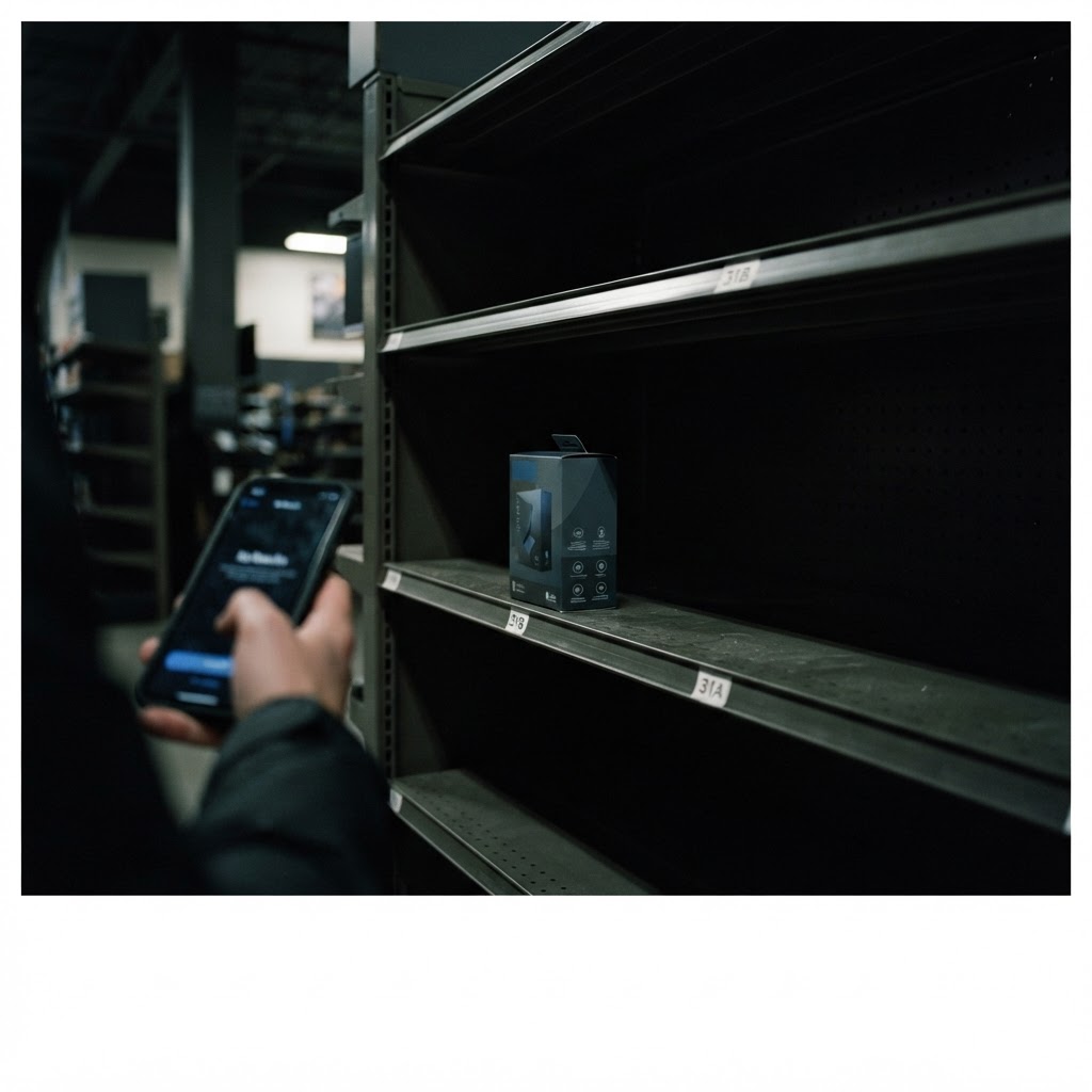
An empty result is a merchandising signal, not just a page-state problem.
The filter panel needs a point of view
Good filtering does not mean exposing every possible attribute. It means prioritizing the few controls that help the largest number of shoppers make progress.
Put high-intent filters first. Price, size, availability, compatibility, and delivery options often matter more than secondary descriptors. Keep labels in customer language. Show applied filters in a clear summary so shoppers can see what is shaping the list and remove one constraint without starting over.
Multiple selections should behave like customers expect. Someone shopping for a black or navy jacket is not asking to choose between two unrelated journeys.
They are defining an acceptable range. Baymard's research on combining filter options is a useful reminder that small interaction decisions can change whether filtering feels like progress or punishment.
Mobile deserves its own review, not a desktop shrink ray. A filter drawer that hides the current result count, traps selections behind several screens, or resets after every choice creates friction right where attention is most limited.

The filter order should reflect the order of real buying decisions.
Taxonomy is an operating problem
A polished filter interface cannot rescue inconsistent product data. If one team calls an attribute “small,” another calls it “compact,” and a third leaves it blank, the customer sees an unreliable store.
Set ownership for the product taxonomy. Define allowed values. Decide how new products inherit attributes. Audit the exceptions that create strange result sets. This is marketing operations work because the output affects paid traffic, organic landing pages, merchandising, customer service, and conversion reporting at the same time.
A practical audit can begin with the top categories by traffic and revenue. For each one, compare the filters customers use, the filters that produce no results, and the products that remain untagged. Then review onsite search queries that return weak or irrelevant lists. The gaps will tell you where the catalog is speaking a language customers do not use.
This is the same measurement discipline behind a better growth measurement system. Do not ask one metric to explain everything. Use filter usage, result quality, product clicks, add-to-cart rate, and conversion together. Each shows a different part of the path.

The useful audit connects interface behavior back to product data and business outcomes.
Measure the shortlist, not just the sale
A filter redesign can improve the experience before it improves revenue. That is why last-click reporting alone can miss the first signs of progress.
Track whether shoppers apply filters, how many selections they make, whether they reach a product detail page, and how often they recover from an empty result. Compare those behaviors by device, category, traffic source, and new versus returning customer.
Do not celebrate a higher filter-use rate automatically. If shoppers apply four filters and still bounce, the panel may be creating work rather than removing it. Pair behavior data with qualitative review. Watch recordings, run task-based tests, and ask people to find a product using their own words.
The strongest success metric is not “more filter clicks.” It is a shorter path from a broad need to a confident product choice. That can show up as better product-list engagement, fewer backtracks, stronger add-to-cart rates, and fewer customer-service questions about basic fit or compatibility.

The real win is not interaction. It is confidence.
A simple filter review
Run this review category by category instead of redesigning the whole catalog at once.
- 1Write down the top customer jobs for the category.
- 2Pull the search terms, support questions, and product returns connected to those jobs.
- 3Map the useful constraints to consistent product attributes.
- 4Remove duplicate, vague, or rarely useful filters.
- 5Test common combinations on mobile and desktop, including combinations that should return no results.
- 6Measure shortlist quality, product engagement, and conversion over time.
The exercise often uncovers a broader issue. A catalog that cannot be filtered cleanly may also be difficult to describe in ads, organize for SEO, or explain in customer service. Fixing the taxonomy can improve several channels because they were all drawing from the same messy source.

The best filter audit usually starts with someone trying to complete a real shopping task.
The filter is a promise
Every filter makes a promise about the store. “In stock” promises availability. “Compatible with” promises a reliable relationship between products. “Under $100” promises that the resulting list respects the shopper's constraint.
Break that promise and trust drops quickly. The customer does not care whether the problem came from a feed, a naming convention, or a merchandising rule. They only know the store asked them to narrow the list and then showed them something that did not fit.
That is why filtering belongs in the same conversation as customer trust after the click. The click is not the finish line. It is where the business has to keep proving that its labels, claims, and product experience line up.

A useful filter feels like the store is helping, not asking the shopper to do database work.
Questions worth answering
What are the most important ecommerce filters?
The answer depends on the category, but start with constraints that change a purchase decision: price, size, availability, compatibility, format, delivery timing, and use case. Validate the list against customer language and actual product data instead of copying a standard template.
Should every product category use the same filters?
No. Shared controls can create consistency, but category-specific filters are often more useful. A camera shopper needs sensor and lens compatibility. A furniture shopper may need dimensions and assembly requirements. A universal filter set usually serves the database better than the customer.
How many filters are too many?
There is no useful universal number. Filters become too many when shoppers cannot predict what they mean, when several controls describe the same difference, or when common combinations produce poor results. Review usage and result quality, not just the count of available fields.
Should filters be indexable for SEO?
Usually not by default. Many filter combinations create thin, duplicate, or low-value URLs. Index only combinations with clear search demand, distinct products, useful copy, and a reason to exist as a landing page. The rest should support navigation without expanding the index unnecessarily.
How can a small store improve filters quickly?
Pick one high-traffic category. Review onsite search, customer questions, returns, and the products with missing attributes. Simplify the filter set, rewrite labels in customer language, fix the highest-impact data gaps, and test the result on a phone before measuring changes.
The next filter your team adds should earn its place. If it does not help a real shopper reject the wrong options, it is probably making the catalog look more organized while leaving the buying decision just as hard.