A product page can carry the whole sale, then lose it with one missing detail. Product pages decide ecommerce conversion because they are where a shopper turns a promise into a judgment.
The ad gets attention. The category page creates a shortlist. The product page has to answer the uncomfortable questions: Will this fit? What will it feel like? Can I trust the photos? What happens if I change my mind?
That makes product-page work more than copy cleanup. It is sales work, merchandising work, customer-service work, and search work in one place.

The product page starts the comparison, whether your brand controls it or not.
Product pages decide ecommerce conversion
Baymard's ongoing product-page research has reviewed thousands of ecommerce site elements and found that many leading stores still deliver mediocre product-page experiences. The problem is rarely one dramatic mistake. It is the slow accumulation of small unknowns.
A shopper sees a polished image but cannot tell scale. The title sounds attractive but leaves out the material. The description talks about benefits but never explains care, compatibility, or delivery. Reviews exist, but the page gives no useful way to sort them.
Each gap adds work. Some shoppers do that work in a search tab. Others leave.
A useful product page is not trying to sound persuasive every second. It is trying to make the decision feel safe.
Nielsen Norman Group's guidance on ecommerce product pages makes the same point in practical terms: product information should be complete without becoming wordy or fluffy.
Start with the buyer's uncertainty
Most teams begin a product-page rewrite with the existing copy. That is backwards. Begin with the questions customers already ask.
Pull them from support tickets, reviews, returns, live chat, search queries, and sales calls. Group them by the kind of doubt they represent:
- Fit: size, dimensions, weight, compatibility, quantity, and scale.
- Feel: texture, scent, finish, softness, noise, or use experience.
- Proof: materials, testing, warranty, source, durability, and real-world photos.
- Risk: shipping, returns, exchanges, care, setup, and what happens when something goes wrong.
That list becomes the page brief. Not the brand adjectives. Not the internal product launch language. The buyer's doubt.

Specifications do more selling when they help someone picture ownership.
The same approach improves customer trust after the click, because trust is built through specific evidence rather than a louder promise.
Description is not decoration
A product description has three jobs. It should identify what the product is, explain why its relevant features matter, and tell the shopper what ownership will require.
That last job is where many pages get thin. A description can say a jacket is lightweight, but the shopper may need to know whether it blocks wind, packs down, or runs small.
A skincare page can describe a finish, but the shopper may need usage instructions, texture, and where the product fits in a routine. A cannabis accessory page can show the object beautifully while leaving out dimensions, cleaning, and compatibility.
Good product copy is concrete. It gives the shopper language they can compare against their own situation.
A simple test works well: remove every adjective that does not help a decision. Keep the detail that changes whether the product feels right.
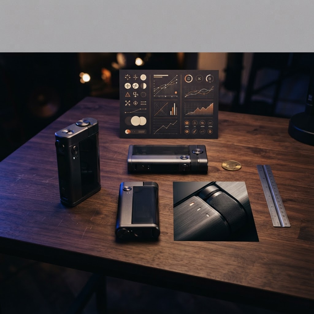
The strongest product copy gives the image something useful to prove.
Images should answer questions
Product photography has a job beyond making the grid look expensive. Each image should resolve a different question.
Use one image to establish the product. Use another to show scale or fit. Show texture close enough to judge. Show the product in use when context changes the decision. Add a detail shot when construction, finish, or connection points matter.
Avoid using five angles that all say the same thing. More images are not automatically more information.
Customer photos can do work that studio photography cannot. They show size in a real room, how an item looks under ordinary light, and what ownership looks like after the unboxing moment. The page should make those images easy to understand, not bury them in a review tab nobody opens.

Real context beats perfect lighting when the shopper is judging fit and use.
Trust lives below the buy button
The buy button gets the attention, but the content below it often decides whether the click feels reckless.
Put return and delivery information close to the decision. Explain what is included. Show the care or setup steps. State the warranty in plain language. If a product has a limitation, say it before the customer discovers it after delivery.
This is not an invitation to cover the page in badges. A trust signal only helps when it answers a real concern. “Premium quality” is not proof. A material specification, clear warranty, or honest fit note is.
Baymard's product-page research is useful here because it treats the page as a decision environment, not a poster for the brand.
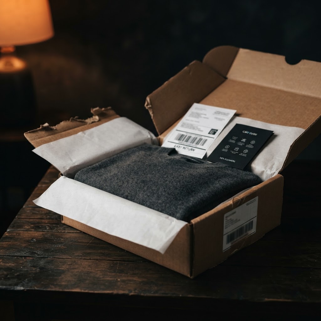
The return policy is part of the product experience before the order is placed.
A clear page also reduces the work that lands on support. That matters even more as order volume grows. The best product page may never show up in a dashboard as a direct win. It shows up as fewer pre-sale questions, fewer avoidable returns, and more confident purchases.
Audit the page like a customer
A product-page audit should end with decisions, not a spreadsheet full of vague scores. Pick a small group of products that represent different categories, price points, and return patterns.
Then ask a reviewer to complete these tasks without help:
- 1Explain what the product is for in one sentence.
- 2Choose the right size, quantity, or configuration.
- 3Find delivery and return information.
- 4Name one reason to trust the product.
- 5Say what could go wrong after purchase.
Record where the reviewer hesitates. That hesitation is the work.
| Page element | Buyer question | Evidence to add | Measure after the change |
|---|---|---|---|
| Title and opening copy | What is this? | Clear product type and use | Product-page engagement |
| Images | What will I receive? | Scale, details, context | Gallery interaction |
| Specifications | Will it work for me? | Dimensions, materials, compatibility | Add-to-cart rate |
| Policies | What if it goes wrong? | Delivery, returns, warranty | Return and support rate |
Use the same discipline you would use for content refresh work and product filters as a conversion tool: identify the customer decision first, then change the experience around it.
Frequently asked questions
Long enough to answer the real buying questions, and no longer. A technical product may need more detail than a simple accessory. The right measure is not word count. It is whether a shopper can make a confident decision without opening another tab.
The product identity, strongest images, price, options, availability, and the information that removes the biggest immediate doubt. Keep delivery and return cues close enough that shoppers do not have to hunt for them.
They can, especially when scale, fit, color, or use context matters. Curate them for relevance and label them clearly. A blurry photo that answers a real question can be more useful than another polished angle.
Use a consistent foundation, not identical content. A piece of apparel needs fit and care information. A device needs compatibility and setup. A regulated product needs accurate, compliant details. The template should make room for the questions that category creates.
Clear product names, useful descriptions, accurate structured data, and strong images help search engines understand the offer. Google's Product structured data documentation explains the markup requirements. Search visibility still depends on the full site, but vague product pages make the job harder for both search engines and shoppers. A product page is not the last stop before checkout. It is the place where the customer decides whether your promise survives contact with reality. If the page answers the real questions, conversion has a chance. If it only repeats the campaign language, the shopper has to finish the sales conversation somewhere else.